
Building a massive desktop and mobile design system from the ground up was one of the best projects I've had the opportunity to take on while working with the team at DIMO. I tackled the project with Daniel and Dora in a cross-team effort between the product and growth teams over a period of a few weeks alongside a ground-up redesign of DIMO's mobile app. The app we'd built at the time was more of a proof-of-concept mixed with a feature showcase which was no longer serving our purposes. Now we had the opportunity to take a more informed approach to building the product and, by extension, had time to dive into a full ground-up build of the design system.
What’s a design system?
A design system is a set of reusable patterns and components that can be used to quickly design applications. By using a design system, designers can dramatically increase product iteration speed by focusing on combining components that fit their needs instead of building them from scratch.
Design systems also help engineering teams move quickly and stay in sync with one another through a consistent shared language. By reusing components and following common standards like spacing, typography, and responsiveness, engineering implementation can focus on building more rather than resolving front-end design problems. Standardization across a design system also means engineers don’t have to have a design background to build really amazing products – just drag, drop, and arrange components that already look great and are intended to fit together.
In short, a design system…
Helps designers move faster with a highly customizable and scalable system.
Helps developers build quicker with standardized components that are easy to implement
Minimizes the gap between conceptualization and implementation by having a source of truth for designers and developers.
Where we drew reference
As DIMO is a mobility app we pulled references from other leaders in the space when building out our system. While we referenced other systems that we like including AirBnb's DLS and Spotify's Encore, we also leaned heavily into the work done at Uber and Lyft when building out some of our foundational components and naming conventions.
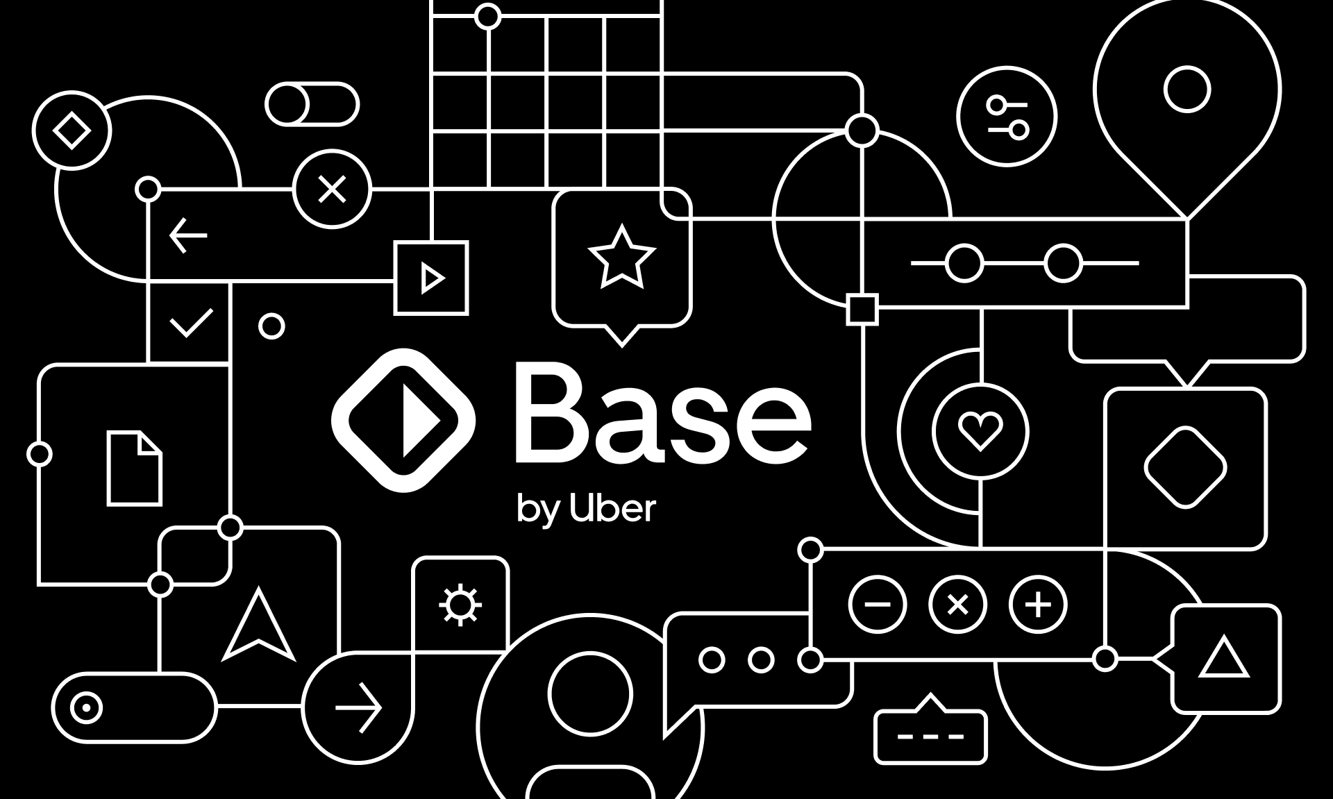
Uber's Base, our primary reference for Pods, set the tone for our naming and file layout conventions.
File structure
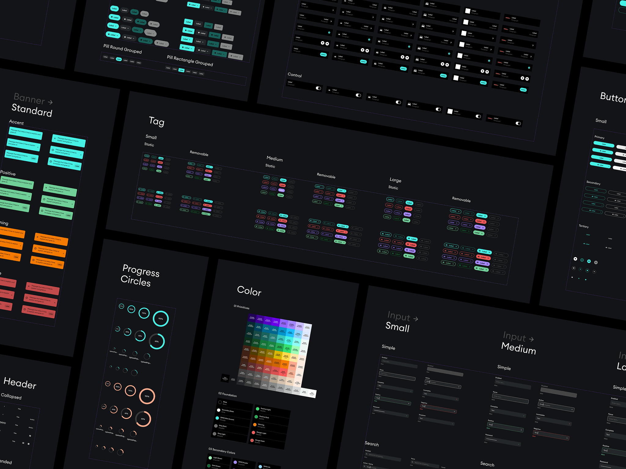
In addition to drawing some component naming reference from Base, the primary other thing we used Uber's system as reference for was its file structure. Daniel, Dora and I agreed that a single page, left to right approach was infinitely preferable to a never-ending list of pages in the sidebar. As you navigate the Pods file, most foundational and atomic components like color styles, text styles, buttons, and list items live on the left side of the canvas while larger molecules are (mostly) built out as you scroll right. We did this to make the canvas more scannable at a glance, and because all of us hate scrolling through 30 pages with five things on them (as well as blank divider pages) if we want to find or edit a component.
What we'd do differently today
We built the Pods system over the summer of 2022 before Figma rolled out a number of autolayout updates which changed and simplified the ways in which I build components today. For example, using spacers for large portions of this specific use case is now largely redundant given the strength of autolayout's horizontal padding, and while in general the system is very effective there are a number of ways in which the construction of its components could be further simplified and made more lightweight. Some of this is preference that I've developed since working on Pods, but others like autolayout wrapping just weren't available when we were building.
Grab a copy
DIMO's goal long term is to enable developers to build other mobility applications using DIMO data, so we decided to release a version of Pods on Figma Community for people to play with. While we don't expect most people to build apps using our design language, we put out our system to give designers an easy starting point to work with some purpose-built components to jumpstart their process. While the Community version hasn't been updated in a while, it's still worth checking out. If you want to read more about the system, I wrote a bit about it when we released it here.
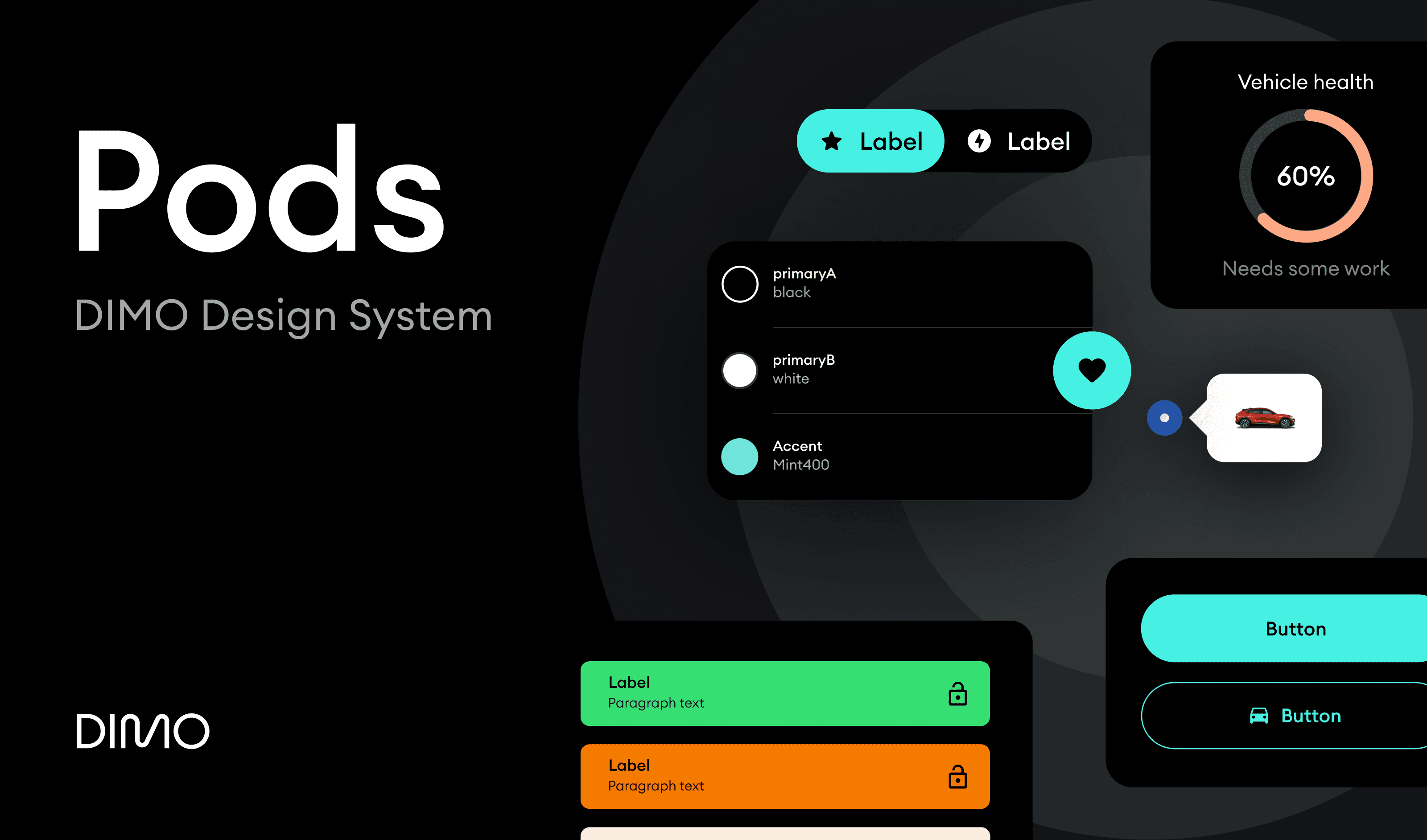
Click the image to check out Pods on Figma Community